
Custom KPI Semi-Arc Chart in Power BI
Building a bespoke Deneb + Vega visualization for category-based KPI representation.
Why a custom visual was the only answer
When designing Power BI dashboards, standard visuals — bars, gauges, donuts — are perfect for showing percentages or single KPIs. But sometimes, numbers alone don’t tell the full story.
I needed to represent a KPI’s progression through achievement levels, such as Beginner → Intermediate → Advanced → Expert. None of the existing visuals captured this concept cleanly, so I decided to build my own.
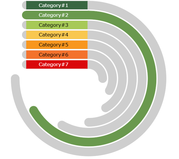
From numeric KPIs to stage-based visuals
The KPI I wanted to show wasn’t about “how much” — it was about “where we are.” Instead of using gauges or progress bars, I designed a semi-circular arc chart built with the Deneb custom visual and Vega JSON specification.
- • Each arc represents one category.
- • Arc length is uniform — it’s the stage, not the number, that matters.
- • Colour progression moves from red → amber → green to show achievement.
- • Rounded end caps soften the geometry and reinforce completion.
- • Clean connectors tie arcs to their labels on the left.
Labels align flush-left for legibility, while light connectors bridge each arc to its narrative.
Inside the Vega specification
The entire chart is generated from a Vega specification embedded inside a Deneb visual in Power BI. Structurally it layers arcs, end caps, and connector lines, all orchestrated through custom signals.
Responsive parameters make the visual reusable: `arcwidth` governs the thickness, `arcgap` handles spacing, and `minsize` scales the chart to fit different report canvases.
These controls keep the design crisp whether you’re showing three categories or ten.
{
  "signals": [
    { "name": "arcwidth", "value": 24 },
    { "name": "arcgap", "value": 16 },
    { "name": "minsize", "value": 480 }
  ],
  "marks": [
    { "type": "arc", "from": {"data": "stages"}, "encode": { ... } }
  ]
}Where the semi-arc chart shines
Skill progressions
Track competencies evolving from beginner to expert tiers.
Risk maturity
Show how controls move from ad-hoc to optimised states.
Project milestones
Map initiatives as they advance through delivery phases.
Geometry, precision, and storytelling
The hardest part was the right-end rounding — aligning the caps perfectly using trigonometric calculations inside Vega. Through experimentation, I refined the signal math until the caps sat flush against the arcs without distorting proportions.
This project reaffirmed that Power BI + Deneb + Vega opens the door to any geometry you can imagine — all within your BI environment.
“Once the end-cap math clicked, the chart felt complete — it moved from an abstract concept to a visual narrative of progress.”
A minimalist canvas for KPI storytelling
The final visual turns ordinal KPI stages into a narrative. It keeps the focus on momentum — inviting stakeholders to see progress as a journey, not just a percentage.
Extend the build
Dive deeper with the tools and references that made this visual possible.
Explore more BI storytelling
Continue through the portfolio to see how data visualisation becomes a narrative edge.